Sunday, November 27, 2016

The fireplace is finished! And to my surprise, I got it finished in time for Thanksgiving!  I am very pleased with how if came out.


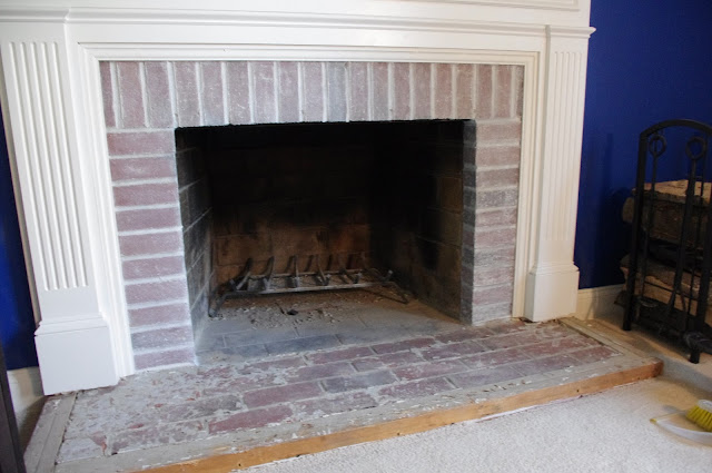
The hearth had this very cheap looking tile on it, which was actually over the original brick.  When the previous owner updated the mantle, they added some width to it.  Instead of adding brick or another stone to the hearth, they framed it with 2x2's and tiled over it.  A cheap fix and that's how it looked.


They used a lot of mastic and it was very difficult to remove.  After trying to hack it off by hand with  a chisel and hammer, Mike took to it with an air chisel and off it came!


I went back and forth and sideways about the brick surround....leave it alone?....tile over it?....paint it?....whitewash it? There were a few conversations about it and I ultimately decided that it needed something and that I would start with whitewashing it.  If I hated the whitewashed brick, I could always paint or tile over it.  Well, I LOVED it!


Now to tiling the hearth....it went very quickly!  And what a difference!


I just love how it looks with the blue walls and pops of orange for Fall!  I can't wait to see how it looks for Christmas!


My next small project is the little brown table.  I started painting it gray and love how its coming out.  It still needs to be waxed and distressed. I will share it when I get around to finishing it.


In the meantime, it gets moved out, along with the brown arm chair, to make room for the Christmas tree.

Happy decorating for the holidays!!!! 


Monday, November 14, 2016

Its been a VERY long time since I posted here.  Life became very busy and I just didn't have the time, but here I am again with another bathroom reveal. Last I wrote, we had just finished the face lift on our upstairs hall bathroom. After we completed that project, we finished a few little things, here and there, and then started on our master bath.

As you can see, it all needed to go. Oh goodness, that yellow paint! For the most part, the entire bathroom was original.  The vanity was newer, but awful and there was laminate flooring covering the original mosaic tile floor.


Demo began and we started to see how much room there was with the wall for the shower removed. It was as if we doubled the bathroom square footage.  Now it was time to plan and design the space. We knew we wanted two pedestal sinks because we only had 50" to the right of the shower and having our own sinks was very important....basically because I don't like to share. So, we shopped around for sinks....I ordered a set from Home Depot and they kept arriving broken.  After 7 sinks, I gave up and bought Kohler pedestals off the shelf from Lowes for under $250 for both.  The kids had fun shopping... they are used to trips to home improvement stores by now!


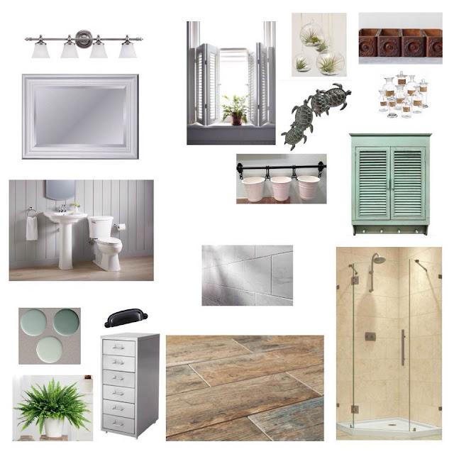
Here is the design concept board for the space.  We wanted it very clean and simple with a bit of a spa feel.
After the demo, plumbing, electrical and sheetrock was complete, it was time for tile.


We started demo in March, the tile was complete in August. Renovating over the summer is very difficult.  I thought it was never going to be finished.  The remainder of the renovation only took a month.


The layout works so much better now, two people can actually get ready at the same time!


Just enough storage for two people, as well. By using this drawer unit from Ikea, we kept the openness from the pedestals.


It was very hard to find bath mats for this layout. I bought two large ones to use one in front of the sinks and then cut one up to use for the shower and the toilet. To keep the mat from fraying, I put a strip of hot glue where it was cut.


Its just so pretty now....and spacious!

My next post will be about our fireplace surround and hearth in our formal living room. We just removed the ugly cheap tile from the hearth and are still deciding what to do with the surround (tile it or paint the existing brick?).  I hope to have it completed and posted by Thanksgiving!


Friday, April 15, 2016

Guest Bathroom Reveal

It's been a while since I posted....

We have been working on our guest bathroom....it was gross and outdated and very 'yellow.' The entire house was painted yellow when we moved in, except the forest green powder room and the magenta kitchen.

Here is the bathroom before:


More yellow walls and beadboard to the ceiling? What were the previous owner thinking?

The plan was to replace the toilet, medicine cabinet, light, vanity cabinet, countertop and plumbing fixtures. The tub and shower were in great shape, a Bathfitter job, so we wanted to just clean up the grout on the floor.


The first step was to replace the toilet, and this happened! That is my kitchen ceiling - you can read all about it here.


After all the mess was cleaned up and we had a funcitioning toilet, it took us a while to get back to this project.

This was my design concept for the bathroom:


I think the bathroom came out pretty close to my design concept.


Now onto the next project! We will be working on the Craft Room and Office for the next two weeks, so look for an update on those two rooms soon!


Wednesday, January 13, 2016

I want a mansion...

Happy New Year!

In early November, I went to Newport, RI, with my friend, Alanna and my little guy, E. We went to tour the mansions, shop and eat!  It was so fun and the town is adorable.  We lucked out with the weather, it was a beautiful weekend! Early November can be very chilly in Newport but we were out and about in fleeces!  Also, the crowds were very small, so we got to see a lot at our own pace.

Mission Burger

After a long ride up north, our first stop was lunch.  We came across a fun burger joint, Mission. The burgers and fries were awesome, the interior was too!

http://www.redfoxdesign.blogspot.com/

This place was full of DIYs and creative solutions that were right up my alley.

http://www.redfoxdesign.blogspot.com/

The stenciling on the natural wood walls was neat, it made me want to stencil something! And look at the bracket holding up the lunch shelf - very cool!

http://www.redfoxdesign.blogspot.com/

There are two rooms with tables and lunch counters to eat at and dividing the two was this opening. Instead of leaving it open, they gave it a privacy treatment by stringing bright colored yarn from hooks in this laser beam pattern - very creative!


They also had mirrors on the wall to help make the space feel bigger and to bounce more light. Instead of leaving the mirror plain, they added chicken wire to the glass to give it texture and interest.  I loved these and think I may have to do this to one of my many mirrors.  (I have a thing for mirrors!)

The Attwater

We checked into our hotel, The Attwater.  This is a beautifully restored building with a trendy modern design that was comfortable and refreshing. Our room was so comfortable and clean.  I loved all the finishes that they picked, from the penny tile floor in the bathroom to the gorgeous dresser nightstands on each side of the bed. I would definitely stay here again.


The Mansions

During our visit, we saw five mansions; The Breakers, The Marble House, The Elms, Rosecliff and Chateau-sur-Mer. We toured the exterior of all five and all the interiors except Chataeu-sur-Mer (they had timed tours only and we didn't have time for the whole tour.) Photography was prohibited inside, which was disappointing, so all interior photos of the mansionsare from other sources.

I loved all the attention to detail in all the mansions, but my favorite parts of all of them were the kitchens, bathrooms and servant stairways!  The were simple and rustic and well used.

Here are some examples (these were not taken by me, photography of the interior was prohibited)


The Breakers
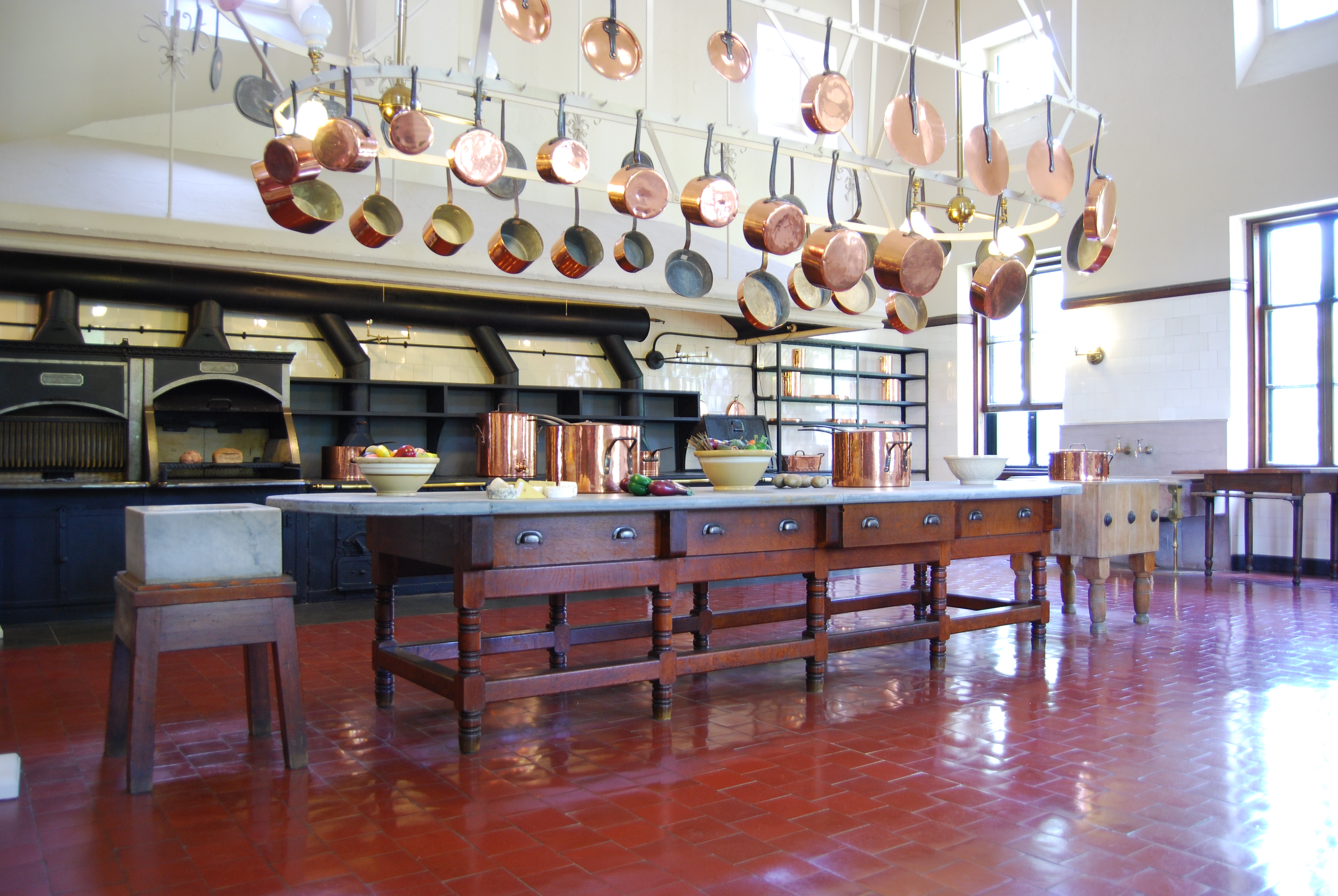


https://en.wikipedia.org/wiki/The_Breakers#/media/File:Breakers_Kitchen.JPG

Look at that island! I decided that the next time I renovate my kitchen, this is going to be the inspiration for my island! I love the massive hood and the giant pot rack, too.  The ceilings are huge and the giant windows bring in an enormous amount of light.

The two-story butler's pantry held all of the dishware for the family.
https://www.yankeemagazine.com/wp-content/uploads/2015/08/The-Breakers-butlers-pantry-Gavin-Ashworth-720x441.jpg

This is the two story butler's pantry. The islands, again, are beautiful! The built-in cabuinety was so impressive. I would be happy as a clam if this was my kitchen! I like the simple contrast of the light floor and ceilings with the dark finish of the cabinetry, its gives the built-ins such presence.


The Elms

http://www.themarthablog.com/2012/09/i-went-on-a-guided-tour-of-the-elms-in-newport-rhode-island.html

Although these are servant stairs, there is still a high level of detail in the wrought iron railings and the style and curve of the staircase, from one landing to the next. Again, the simple contrast of the white scrolls and dark wood railing is refreshing.

http://www.themarthablog.com/2012/09/i-went-on-a-guided-tour-of-the-elms-in-newport-rhode-island.html

The marble on the walls and floors of this bathroom is beautiful. Although the mirror is a bit decorative compared to the rest of the space, I like that it adds a feminine air to the very simple white bathroom.

The Elms Conservatory, a French-inspired garden room
https://www.yankeemagazine.com/wp-content/uploads/2015/08/The-Elms-conservatory-Gavin-Ashworth.jpg
The french inspired conservatory, though not a servant area, was my favorite non-servant room of the tour. The light that came in the room was stunning, warming the cold surfaces of the concrete and marble. I could imagine beautiful flowering plants filling the room all year long.  I would love a conservatory, but right now I will have to settle for a sun room!

Rosecliff


http://mosawra.tumblr.com/post/33095464722

Here is a timeless white bathroom. I love the detail on the tile and the chunky appearance of the tub. The windows are huge, brightening up the large white space.


After looking at all the gorgeous, fine detail and intricate furnishings of the Newport Mansions, it was nice to see and appreciate the simple parts, too.